Getting traffic to a vet clinic website is only half the job. If pet owners land on the site and do nothing, the traffic has little business value. What matters is what happens next. Do they call? Do they book? Do they send an enquiry? Do they find the right service fast enough on mobile before they go back to Google?
Good clinic websites make the next step obvious. Great ones remove friction at every point. They guide a pet owner from search to service page to action without confusion.
That matters even more for vets because search behaviour is often urgent. A pet owner looking for vaccinations may browse. A pet owner searching for a limping dog, after-hours help or a new local clinic wants answers quickly. If your site is slow, cluttered or vague, you lose the booking.
If you have not yet mapped out the right structure, start with What Pages Should a Vet Clinic Website Have?. Once the key pages exist, the next step is improving how those pages convert.
Think in conversion paths, not just traffic
A conversion path is the route a visitor takes from arrival to action. For a vet clinic, the most common paths are simple:
- Search to phone call
- Search to online booking
- Search to contact form enquiry
- Search to service page to booking
- Search to emergency info to immediate call
Each path needs its own support on the website. If every page relies on one generic contact button in the header, you are asking too much of the visitor. People do not want to hunt for the next step.
A better approach is to match the page to the intent. A desexing page should lead clearly to booking. A puppy vaccination page should explain the service, build trust and make it easy to request an appointment. An emergency care page should put the phone number and opening hours first.
Phone calls still matter
For many clinics, the phone is the highest-value conversion point. It is fast, familiar and often preferred by pet owners who want reassurance before they book.
That means the phone number should be easy to find across the site, especially on mobile. It should appear in the header, contact page and key service pages. On mobile, it should be tap-to-call. If someone has to copy and paste a number, you are adding friction for no reason.
Think about intent here. A pet owner searching for dental cleaning may want pricing or timing. A pet owner searching for an unwell cat may want a human voice immediately. Both should be able to call in one tap.
Phone-driven pages often need:
- A visible phone number near the top of the page
- Clear clinic hours
- After-hours instructions where relevant
- Short service summaries
- A strong call to action such as Call our clinic or Speak with our team
Many clinic owners underestimate how many website leads start with a call. If you are serious about growth, treat call tracking as essential, not optional.
Online booking should be obvious, not buried
Online booking works best when it is easy, expected and available at the right moment. It should not sit hidden in the menu while service pages push visitors toward a general contact page.
If your clinic offers online booking, place it where people naturally look:
- In the main navigation
- Near the top of service pages
- Again lower on the page after service details
- On mobile as a clear button
- On the contact page with a direct booking route
Make the wording plain. Book online is better than vague labels. Pet owners should never have to guess whether they are booking, making an enquiry or reading more information.
Also think about what happens before the booking click. Many visitors need enough confidence first. They may want to know:
- What the service includes
- Which pets you treat
- Whether they need to prepare anything
- What happens at the appointment
- Whether the clinic is local and easy to reach
That is why your booking button should sit alongside useful content, not replace it.
Service pages do the heavy lifting
One of the biggest missed opportunities on vet websites is weak service pages. Too many clinics have one broad services page with a short list and little detail. That creates poor user experience and makes conversion harder.
Strong service pages help in two ways. They give pet owners a better answer. They also create better landing pages for search traffic.
A good service page should cover:
- What the service is
- Who it is for
- Common signs or reasons to book
- What to expect at the clinic
- Relevant trust signals
- A direct next step
For example, a dental care page might explain why pets need dental checks, what symptoms to look for, what happens during an assessment and how to book. A vaccinations page might cover puppy and kitten schedules, booster appointments and when to contact the clinic.
Every key service page should answer one commercial question clearly: Why should this pet owner book now?
If you want a stronger framework for building pages that support search and lead generation, see our veterinary website SEO support page.
Trust signals reduce hesitation
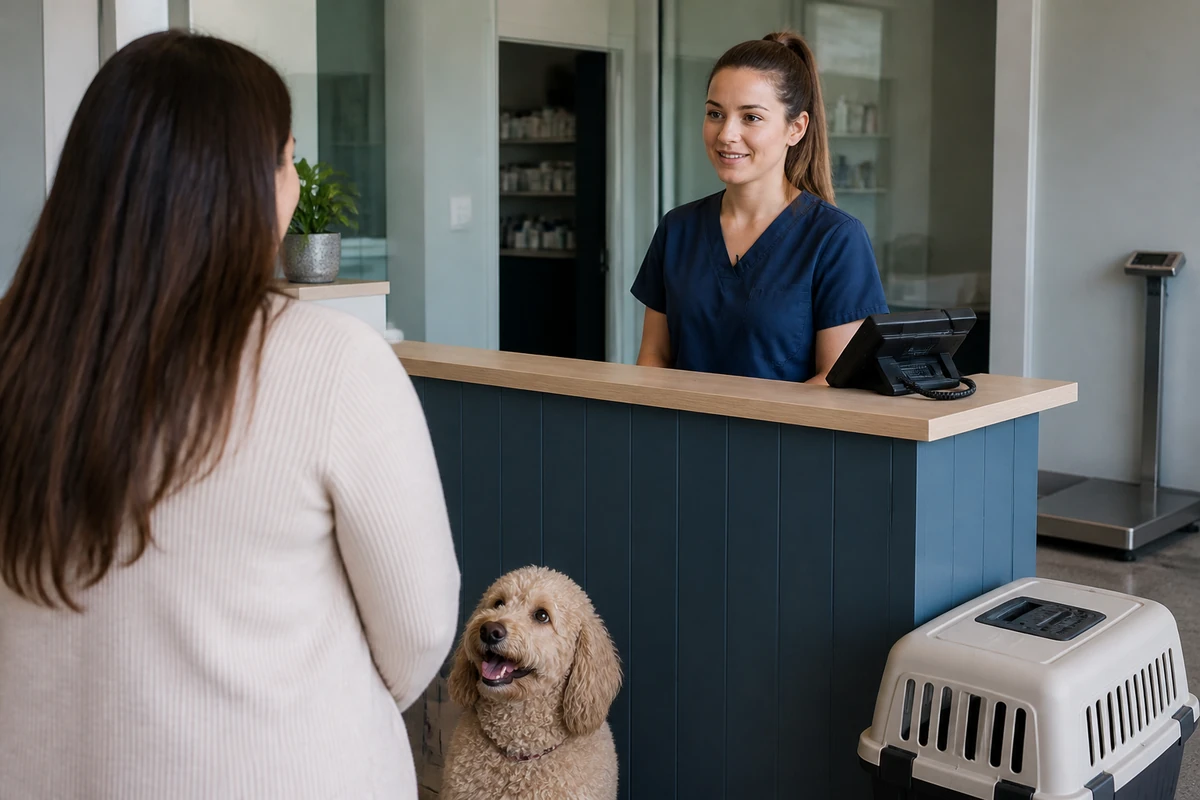
Pet owners are not choosing a dry cleaner. They are choosing who will care for an animal they love. Trust matters at every step.
That trust starts before the visitor contacts you. It is shaped by the look of the site, the clarity of the wording and the signals that show the clinic is credible and caring.
Useful trust signals include:
- Real photos of the clinic and team
- Clear location and contact details
- Reviews from real clients
- Accreditations and memberships where relevant
- Specific service information
- Opening hours and emergency guidance
- FAQs that remove uncertainty
What does not help is generic copy that says little. Pet owners want signs that your clinic is established, local and ready to help.
Even simple wording can improve trust. Compare these two examples.
- Weak: We offer quality pet care services.
- Better: Our team provides consultations, vaccinations, dental care and surgery for dogs, cats and small pets, with online booking available for routine appointments.
The second version is clearer, more grounded and more useful.
Contact forms should be short and specific
Forms still matter, especially for new client enquiries, non-urgent questions and appointment requests outside business hours. But most contact forms ask for too much or too little.
A long form feels like work. A vague one creates admin problems because the clinic has to chase missing details.
The best vet clinic forms are short and practical. Ask only for what helps the team respond properly. In many cases that means:
- Name
- Phone number
- Email address
- Pet type
- Reason for enquiry
- Preferred appointment time
If the form is for general enquiries, say that. If it is for appointment requests, label it clearly. If it is not for emergencies, state that plainly and direct urgent cases to call.
You can also improve conversion by placing forms in context. A contact form works better when the page explains what happens after submission. For example: Send your request and our team will contact you during business hours to confirm an appointment time.
Mobile layout can make or break bookings
Most vet clinic traffic now comes through phones. That changes the way people move through your site. They scroll quickly. They skim. They want buttons that are easy to tap. They do not want pop-ups blocking the screen.
Mobile layout is not just a design issue. It is a conversion issue.
Check your site on a real phone, not just a desktop preview. Then ask:
- Can I see the main call to action without hunting?
- Is the phone number clickable?
- Are headings easy to scan?
- Is the text readable without zooming?
- Do booking buttons stand out?
- Does the map, form or menu get in the way?
A clinic may have good service information, but if the layout is clumsy on mobile, the result is the same. Lost enquiries. Lost bookings. Lost calls.
This is even more important for urgent or after-hours searches. Someone with a distressed pet will not patiently navigate a messy website.
Homepage traffic is not enough
Many clinics expect the homepage to do everything. That is a mistake. Search traffic often lands on internal pages first, especially service pages. If those pages are thin or disconnected, the visitor may never reach the homepage at all.
Each important landing page should stand on its own. It should give enough information to reassure the visitor and enough direction to produce an action.
That means your internal pages should not feel like dead ends. Add:
- Clear service-specific calls to action
- Links to related services
- Contact details where relevant
- Booking prompts in the body copy
- Location cues for local users
For example, a page about puppy vaccinations might link naturally to desexing, health checks and new client information. That keeps people moving through the site instead of bouncing out.
Measure what leads to bookings
If you do not track conversions, you are guessing. Traffic numbers alone do not tell you which pages are producing real business outcomes.
Vet clinics should track actions that matter commercially. At a minimum, that usually includes:
- Phone number clicks
- Online booking button clicks
- Contact form submissions
- Email clicks
- Map clicks for directions
Once that is in place, you can start asking smarter questions. Which service pages lead to calls? Which pages drive online bookings? Which traffic sources produce real enquiries? Which mobile pages underperform?
This is where many clinics waste opportunity. They may invest in content or web changes without knowing whether those changes improved booking behaviour. Proper tracking gives you a cleaner picture of what is working.
If you are also reviewing spend and planning, it helps to understand broader pricing expectations around SEO cost Australia before committing to bigger website or growth work.
Match the call to action to the page intent
Not every page needs the same CTA. A one-size-fits-all website often underperforms because it ignores user intent.
Here is a simple way to think about it:
Routine care pages
Use booking-focused CTAs. Examples include vaccinations, health checks and nail clipping.
Higher-consideration services
Use trust and enquiry CTAs. Examples include surgery, dental treatment or diagnostics.
Urgent care pages
Use call-first CTAs. Put the phone number and immediate instructions first.
New client pages
Use registration or appointment request CTAs. Explain the next step clearly.
When the CTA matches the visitor’s mindset, conversion gets easier.
Simple fixes often beat full rebuilds
Some clinics assume poor conversion means they need a brand new website. Sometimes that is true. Often it is not.
Common wins come from practical changes such as:
- Adding clear booking buttons to service pages
- Making the phone number tap-to-call on mobile
- Shortening contact forms
- Rewriting weak service copy
- Adding reviews and trust elements near calls to action
- Improving page speed on mobile
- Clarifying emergency and after-hours instructions
These are not flashy updates. They are commercial ones. They help more visitors take the next step.
What a better vet clinic conversion path looks like
Here is a practical example.
A pet owner searches for cat vaccinations in their area. They land on your vaccinations page. The page explains what is included, when vaccinations are due and what happens at the appointment. It shows your clinic location, includes a review, and offers a clear Book online button near the top. On mobile, the button is obvious and easy to tap. If they prefer to call, the number is right there.
That is a clean conversion path.
Now compare it to a weaker version. The visitor lands on a broad services page with a short list, no specific details, a crowded layout and a generic contact form at the bottom. They are not sure whether the clinic is close, whether online booking is available or what the next step should be. They leave.
The difference is not traffic. It is path design.
Final thought
More traffic does not automatically mean more appointments. Vet clinics grow when the website makes action easy. Clear service pages. Strong trust signals. Fast mobile layout. Simple forms. Obvious phone and booking options. Tracking that shows what is producing real leads.
If your site gets visits but not enough enquiries, the issue may not be reach. It may be conversion. Fix the path, and the bookings become easier to win.
Want a vet website that turns more visits into calls and bookings? Start by reviewing your service pages, mobile experience and conversion tracking, then tighten every step between search and enquiry.