Your website should help pet owners take the next step fast. Call. Book. Ask a question. Find urgent care. If that path is slow, vague or confusing, people leave.
That matters more in veterinary care than most industries. A pet owner may be stressed, short on time and searching on a phone. They do not want to decode your navigation, hunt for your opening hours or guess whether you handle emergencies.
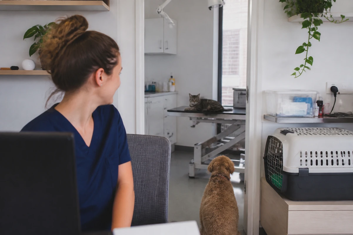
Many vet clinic websites look decent at first glance. Nice photos. Friendly copy. A booking button somewhere in the menu. But small mistakes in structure and wording can quietly cost new appointments every week.
This article covers the website problems that most often get in the way of calls and bookings, and what to do instead.
1. Weak calls to action that do not move people
A surprising number of vet websites never clearly ask the visitor to do anything.
The button says Learn More. The contact page says Get In Touch. The service page ends with nothing at all. That creates friction.
Pet owners do not need a vague prompt. They need a clear next step based on what they came for.
What goes wrong
- The main call to action is hidden below the fold
- Buttons are generic and low intent
- There is no phone number near key decision points
- Service pages end without a booking prompt
- Mobile users have to scroll back up to take action
What to do instead
Match the call to action to the page intent.
- For routine care pages, use Book an appointment
- For urgent care pages, use Call now
- For new client pages, use Register your pet
- For surgery or dental pages, use Request a booking
Repeat the call to action in sensible places. Near the top. Mid-page. End of page. On mobile, make it easy to tap.
If you want a strong example of how local intent connects with booking behaviour, read Local Search for Vet Clinics: Suburb, Maps and Near Me Searches.
2. Thin service pages that say almost nothing
One of the biggest booking killers is the thin service page.
A clinic may offer vaccinations, desexing, dentistry, diagnostics, skin care and puppy checks. But each service gets one short paragraph with no detail. That hurts decision-making.
It also makes it harder for search engines and real people to understand what the page is about.
What a thin page usually looks like
- A generic heading like Our Services
- Two or three vague sentences
- No explanation of who the service is for
- No symptoms, conditions or common questions
- No mention of process, timing or next steps
- No clear way to book from that page
Thin pages fail because they do not answer the pet owner’s real questions. If someone is searching for cat dental care, they want to know what signs to watch for, what happens at the appointment and how to book. A thin page does none of that.
What stronger service pages include
- Who the service is for
- Common signs or reasons to book
- What the appointment involves
- What happens before and after treatment
- Clear suburb or clinic location relevance where natural
- A direct booking or call prompt
This is where website SEO for vet clinics becomes practical, not theoretical. Better service pages do not just help rankings. They help worried pet owners feel ready to take action.
3. Unclear emergency wording that creates hesitation
Emergency and after-hours wording must be crystal clear.
Too many clinics use fuzzy language such as contact us for urgent matters without saying what counts as urgent, whether the clinic is open, or where to go outside business hours.
That uncertainty costs calls. Worse, it can create a poor experience for pet owners under pressure.
Common emergency wording mistakes
- No dedicated emergency information at all
- No after-hours instructions
- Opening hours that conflict across pages
- A booking form on pages that should lead with a phone number
- No mention of referral hospitals or emergency partners if relevant
What clear emergency copy looks like
Be direct. If you offer urgent appointments during opening hours, say so. If you are not an emergency hospital, say where people should call after hours. If your phone line redirects, explain that plainly.
For example:
- For urgent concerns during clinic hours, call our team now
- For after-hours emergencies, contact [emergency provider]
- If your pet is having trouble breathing, call immediately
Do not bury this in a footer. Put it in the header, contact page and any emergency-related page.
4. Missing trust signals that leave new clients unsure
Pet owners are not just comparing price or distance. They are asking a bigger question. Can I trust this clinic with my animal?
If your website does not answer that well, some people will keep looking.
Trust signals many clinic sites miss
- Photos of the actual clinic and team
- Vet and nurse profiles
- Google reviews or review prompts
- Accreditation or association details where relevant
- Clear contact details and opening hours
- Policies on payments, emergencies or new clients
- Real explanations of services, not generic filler copy
Trust is built in small moments. A first-time visitor lands on your puppy vaccination page. They can see who they are booking with. They can read your opening hours. They can see the clinic location. They can confirm you handle nervous pets. That lowers doubt.
Trust also matters for larger practices and referral settings. If your clinic is more complex, this becomes even more important. Related reading: How Animal Hospitals Can Build Trust Before Pet Owners Book.
5. Slow pages that lose people before they act
Speed is not a technical vanity metric. It affects real bookings.
If a page drags on mobile, people leave. If the booking form loads slowly, people give up. If giant images choke the page, your nice design starts costing enquiries.
Common causes of slow vet websites
- Oversized banner images
- Video backgrounds on key landing pages
- Too many scripts, popups or widgets
- Bloated themes and page builders
- No image compression
- Poor hosting
Vet clinic websites often carry extra friction because they try to do too much on one page. Sliding galleries. Instagram feeds. Maps. Popups. Chat widgets. Review plugins. That stack can slow the page enough to affect conversions.
What to prioritise
- Fast loading on mobile first
- Compressed images
- Simple page layouts
- Lean forms
- Booking buttons that work immediately
If a pet owner is standing in a car park with a sick dog, every second matters. Speed is part of service.
6. Poor mobile layout that makes simple actions hard
Most clinic owners still review their website on a desktop. Many pet owners do not.
They search on a phone while commuting, at work, on the couch or in a stressful moment. If your site looks awkward on mobile, that alone can cost appointments.
Mobile problems that hurt bookings
- Tiny buttons that are hard to tap
- Phone numbers that are not clickable
- Long paragraphs with no spacing
- Menus that hide important pages
- Booking tools that break on smaller screens
- Sticky elements that cover content
A common issue is the mobile header. It may show a hamburger menu and little else. No phone button. No booking button. No emergency prompt. That forces the visitor to hunt.
What a better mobile experience does
- Puts call and booking actions in easy reach
- Keeps emergency info visible where appropriate
- Uses short sections and readable text
- Removes clutter from forms and popups
- Makes location, hours and services easy to scan
Test your site like a client would. Use one hand. Use a slow connection. Try to book from a service page, not just the homepage. You will spot problems quickly.
7. Confusing booking paths with too many steps
A vet website can lose a booking even when the visitor wants to book.
Why? Because the path is messy.
The user clicks a service page, then the contact page, then a third-party booking system, then a dropdown with unclear options, then a long intake form. Somewhere in that sequence, motivation drops.
Signs your booking path is too confusing
- Different buttons lead to different systems
- Routine bookings and urgent calls are mixed together
- The service page does not link to the right booking step
- The booking tool asks for too much too early
- There is no fallback phone option
Make the path obvious. If the page is about vaccinations, the booking action should feel connected to that service. If online booking is not suitable for urgent cases, say that clearly and give a phone number instead.
A simpler model
- Routine care pages lead to online booking
- Urgent care pages lead to a phone call
- Complex procedures lead to an enquiry or call request
- New client pages explain registration and next steps
Do not make users figure out your internal workflow. Build around their intent.
8. Contact pages that hide basic information
Your contact page should be one of the highest-converting pages on the site. On many clinic websites, it is one of the weakest.
Some pages show a map and a form, but no clear hours. Others show a phone number but no parking details, no after-hours instructions and no mention of whether online booking is available.
What a strong contact page should include
- Phone number
- Address
- Opening hours
- Booking option
- Emergency or after-hours instructions
- Map and access details if useful
- New client information if relevant
This page is not just for contact. It often becomes the final check before a booking. If key details are missing, confidence drops.
9. Generic homepage copy that could belong to any clinic
If your homepage says you provide caring, compassionate service for all pets, that is fine. But it is not enough.
Most clinics say something similar. Generic copy does not help people quickly understand what makes your clinic the right fit.
What stronger homepage messaging does
- Explains who you help and what you offer
- Highlights core services clearly
- Mentions location and service area naturally
- Shows how to book
- Builds trust with team, reviews and clinic details
A strong homepage acts like a guide. It points visitors to the right service page, answers common questions fast and gives them a clear action to take.
10. No measurement of what turns visits into appointments
This mistake is less visible, but still expensive. Many clinics do not track what their website is actually producing.
If you cannot see where calls, forms and booking clicks come from, it is hard to improve the site properly.
What to track
- Phone clicks from mobile
- Online booking clicks
- Contact form submissions
- Email clicks
- Direction clicks if relevant
- Traffic to key service pages
Without this data, website decisions become guesswork. You may spend time rewriting the homepage when the real leak is a poor booking path on the dental page or unclear emergency wording on mobile.
A quick way to audit your own site
If you want a fast check, review your website using these questions:
- Can a first-time visitor tell what services you offer in under 10 seconds?
- Is there a clear booking or call action near the top of key pages?
- Do your service pages answer real pet owner questions?
- Is emergency and after-hours wording obvious?
- Can someone book easily on a phone?
- Do your pages load quickly?
- Do you show enough proof to build trust?
- Can you track what leads to appointments?
If several answers are no, the website is likely leaking demand.
Fix the path, not just the design
A better vet website is not just prettier. It is clearer. Faster. Easier to act on.
The clinics that win more bookings usually make simple things simple. They show the right service pages. They use direct calls to action. They make mobile easy. They remove doubt before the visitor leaves.
If your clinic website looks fine but enquiries feel inconsistent, start with the basics above. Small fixes can make a real commercial difference.
Want a sharper booking-focused website for your clinic? Review your service pages, mobile experience and call to action paths first. Those are often the fastest wins.